Peter Cooper Village Stuyvesant Town
Project Challenge — After the offices of Peter Cooper Village Stuyvesant Town (PCVST)—a New York City housing complex—were damaged in Hurricane Sandy, the company’s management required a new workspace and quickly. But they also wanted a lasting office that would suit their needs as an organization while retaining a sense of brand.
“Since this company’s employees are in and out of the office all the time, we thought about how to blend different work styles and share office space,” says Justyna Mrowiec-Chun, a designer from the architectural firm FXCollaborative in charge of the project. “Due to its unique location on a steeply sloped site, the building transitions from an above-grade public entrance to a below-grade employee entrance,” says Mrowiec-Chun. Within these subterranean areas, the team needed to create an open, airy space with very little natural light. Case study continues below.
Download the Peter Cooper Village Stuyvesant Town Case Study


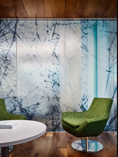
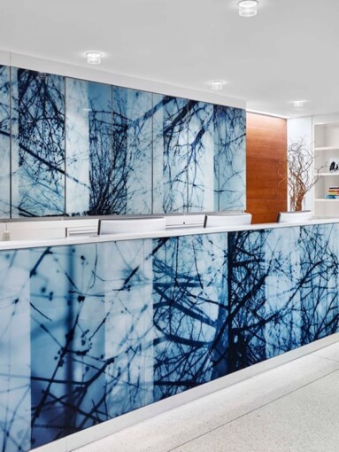
Our Solution — FXCollaborative engaged Skyline to help create an environment that embodies the attributes of the business and infuses a sense of expansive openness. Glass was selected to make the most of the natural light that filters into the space through strategically placed skylights. The Neil’s Branches artwork by artist Doug Fogelson was chosen from Skyline’s patterned glass collection, which uses digital printing to produce a translucent result, while the addition of Vitracolor® back-paint was added for areas that needed more solitude.
“The company required an interior that could be converted into a large town hall meeting space,” explains Mrowiec-Chun. “The glass creates a great backdrop to office activities and provides both translucency and privacy. The client was clear about wanting privacy in the conference rooms while allowing daylight in.” Blue tones from the PCVST logo were repeated in the glass pattern to further communicate brand identity and create a cohesive working environment.
Result —The selection of Fogelson’s Neil’s Branches artwork from Skyline’s patterned glass collection fosters a connection between the work culture of PCVST and the 80-acre park their new offices are situated on. Reference to the natural landscape and PCVST’s adaptive work style results in a cohesive, unified space that brings art and nature into a dialogue with architecture, while seamlessly integrating the client’s brand into its physical location. “The tree branch graphic provides continuity of color theme and branding throughout the project,” says Mrowiec-Chun. “This was a perfect product to achieve our aim.”
Stay in the Glass Loop
Get the latest Skyline news and product info delivered to your inbox.


